


Pantone has once again set the wheels in motion for next year's design trends. The worldwide color authority made an unprecedented move when it announced that Rose Quartz (mineral pink) and Serenity (cool blue) would share the honors of 2016's Colors of the Year. In years past, only one was chosen. But why the bold move and why now, you may ask?
According to their press release, the decision reflects the changing modes of thought when it comes to gender acceptance and fluidity. With that in mind, here are a few design ideas for incorporating these gentle and comforting hues into your current home decor.
Pair With a More Dramatic Hue
Pantone's intention was to create a balance between two colors that evoke peace and tranquility. When incorporating these mild tones into your home decor, you may want to add a more dramatic element to offset the modest nature of these colors. To do so, combine these relaxing hues with their bolder and richer counterparts, like navy blue or mauve. For a more contemporary room, combine the subtle hues with neutrals like off-white and gray.
Use for the Effects
If Pantone's original mission statement rang true to you, incorporate these pale colors into areas of your home that could use softening. The powder blue and pale pink blend to create a calm and serene effect, perfect for unwinding in a busy space. For example, assimilate this perfect pairing into your master bedroom for a relaxing and peaceful ambiance. Nothing evokes a soothing feeling more than these unassuming colors.
Accessorize
If you aren't willing to jump on the Pantone bandwagon, start with baby steps. Use simple accessories to create accents in a room. Rose Quartz or Serenity dinnerware, votives, artwork, vases, and throw pillows pair well with anything from silver to gold to matte and even metallic finishes. A Rose Quartz throw pillow requires considerably less commitment than, let's say, painting a wall. If you're willing to take another baby step, paint a single wall in these soft colors and pair it with neutral, modern furniture for that clean and sophisticated look.
Think Outside the House
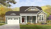
Why should the inside of your home get all of the attention? The Pantone Colors of the Year work perfectly outside your home too. In fact, they reflect the airy and ethereal blue sky along with the tranquil and spiritual Rose Quartz stone. Add some bluebells or peonies to your front garden to mix it up. Place them along a garden fence to create an alluring trim and increase curb appeal.
Go Bold
There are going to be a select few of you who absolutely fell in love with these muted hues. If you aren't afraid of committing to these colors, why not paint all the walls in a room with either Rose Quartz or Serenity? Afterward, add a splash of a complementary color with a sofa or chair. Ramp up your color scheme with a fuzzy patterned rug. Still not enough for you? Paint the ceiling one of these colors.
Pantone's Colors of the Year are versatile pastels that work as accents or the main colors of a room. Once relegated to nursery bedrooms, Rose Quartz and Serenity now add luxury, tranquility, and refinement to any room. If you want to make your home even more relaxing, Rose Quartz and Serenity are the way to go.

.svg "ColorWhite (1)")
.jpg?width=83&name=30th%20Anniversary%20seal%20digital2%20(1).jpg "30th Anniversary seal digital2 (1)")

